RoadRunner Rifle Rest
The RoadRunner Rifle Rest is an innovative device designed for outdoor enthusiasts, particularly hunters and photographers, who need stable support for precision shots.
Context
RoadRunner Rifle Rest is a company focused on outdoor enthusiasts who prioritize accuracy and stability in activities like hunting and photography. The company’s signature product converts trekking poles into stable platforms, offering enhanced user support. I developed the brand identity and visual system, including the logo design, packaging, and a pre-launch landing page for the product’s June 2024 release.
The Problem
The challenge was to create a brand identity and design system that stood out in the competitive hunting gear market while maintaining a cohesive and functional visual style. The logo needed to reflect the product’s core attributes of precision and agility, and the packaging had to be durable and visually appealing to resonate with the target audience.
The Solution
Through research and discovery, I crafted a unique brand identity using bold colors—hunter orange and navy blue—which underwent extensive testing for consistency across digital and print formats. I designed the logo based on the roadrunner bird, symbolizing speed and precision, and collaborated with the team to mold it into the product for durability. The packaging was designed with technical illustrations and compact features, ensuring all components were neatly contained. Finally, I created a wireframe for the pre-launch website, guiding the web manager in developing a parallax site that integrated product videos and photography to boost engagement during the product launch.
B2C VISUAL IDENTITY: CASE STUDY PROJECT OVERVIEW
Project Type: Brand
Brand Identity and Design System
Team
Art Director/Designer - Jennifer Wanderer
Web Manager - Duncan Blake
Contribution
Research and Discovery, Logo Design, Visual Identity, Brand Guidelines, Brand Assets, Collateral Design, Packaging Design, Brand Collateral, Print Assets, Website Launch Wireframe
DESIGN PROCESS
Research
My initial steps involved a thorough analysis of the hunting industry pinpointing distinctive colors that would set RoadRunner Rifle Rest apart.
I observed in the research, the market predominantly features colors in browns, greens, muted grays, and occasional pops of orange.
Mood Board
Color was a key element in defining RoadRunner Rifle Rest’s visual brand identity, with a carefully selected palette that balanced vibrancy and natural tones, ensuring the logo and overall branding conveyed both energy and a connection to the outdoors.
Logo Concept Development
The client requested a logo that captured not only the roadrunner's agility and quickness but also conveyed the product's core function.
Additionally, the client needed two types of logos: a Combination Mark Logo and, as space on the product was limited, a Word Mark Logo. After developing several concepts, I focused on a design featuring a dynamic, running roadrunner with visual speed elements in the typography.
I illustrated a spotting scope that was incorporated into the logo, symbolizing the precision required in both hunting and photography. This design appeals to hunters and bird watchers alike, highlighting the importance of accuracy in their pursuits. The final logos capture the essence of swiftness and precision, reflecting the core utility of the RoadRunner Rifle Rest.
LOGO DISCOVERY
Inspiration
The RoadRunner Rifle Rest logo draws inspiration from the roadrunner bird, embodying speed, precision, and resilience. Reflecting the client's experiences at the RoadRunner Ranch in Texas, the logo captures the bird's essence with a distinctive and contemporary design.


VISUAL IDENTITY
Font Pairing
Pairing Outfit.io with DM Sans creates a cohesive blend: Outfit.io lends a bold, distinctive look to headlines and subheads, complemented by DM Sans's clean, readable style for body text. This pairing establishes a clear visual hierarchy and reinforces brand consistency with complementary sans serif fonts.
Brand Colors
Initially, finding the right hunter orange shade to work well across RGB and CMYK was challenging. Additionally, selecting a dark navy blue/black posed difficulties, as it needed to complement the orange without veering into unintended themes (Halloween).
During extensive CMYK testing, I adjusted the navy blue/black hue to ensure consistency across different paper types, combating variations in paper porosity that occasionally skewed the color towards a brighter blue or jet black. It was crucial that these CMYK values also matched the RGB values used on the landing page and social media channels for brand consistency.
Throughout the process, Pantone colors were used as the primary reference for accurate reproduction on packaging and printed materials, supported by various applications, color.a11y.com and coolors.co to match RGB/HEX colors for digital assets.


GRAPHIC ELEMENTS AND ICONOGRAPHY
Picograms and Patterns
Pictograms for the RoadRunner Rifle Rest were crafted using basic geometric shapes to effectively communicate key concepts. These minimalist icons serve to enhance understanding and visual appeal across various brand materials.
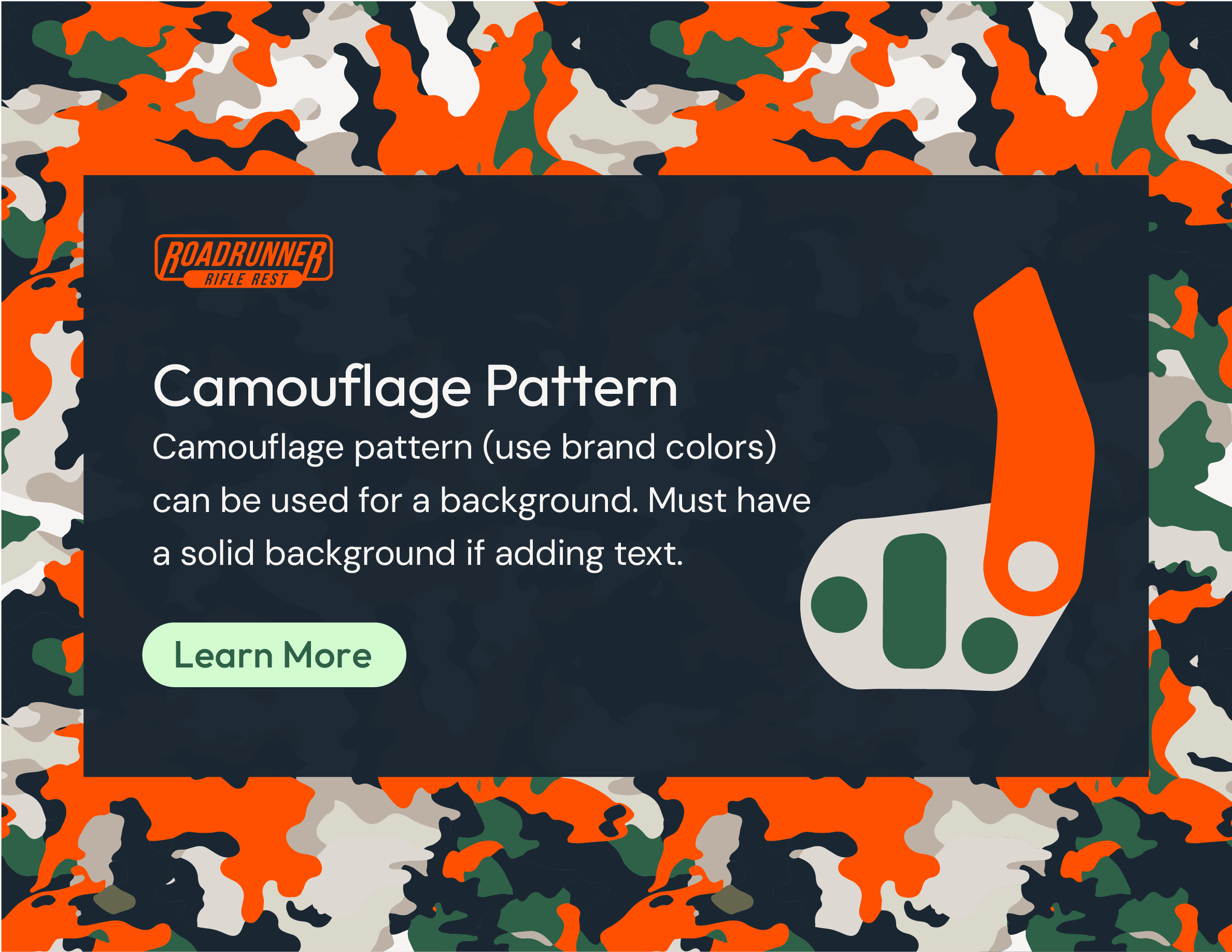
Additionally, I designed hunting-inspired patterns using the brand's colors. These patterns are strategically applied in flyers, ads, tradeshow booth graphics, and as backgrounds for product icons, adding texture and visual interest while resonating with the hunting community.
Brand Guidelines
PACKAGING
Molded Logo Solution
Collaborating with my client and their design engineer, we explored the most durable method for incorporating the logo onto the product. Initially, we considered printing directly on the device, but the rugged usage would have caused the ink to chip and wear off quickly. Stickers were another option, but faced similar durability issues.
The engineer proposed an excellent solution: molding the logo into the product itself. This approach not only addressed the wear and tear concerns but also proved to be economically sound, as the logo was embedded in a detachable section called the slide, making future rebranding simple and cost-effective.
Packaging
In collaboration with the design engineer, we developed a custom hang tag that securely allowed the device to be screwed onto the packaging itself. After multiple iterations, we fine-tuned the size and shape of the package to optimize both functionality and presentation.
It was essential to allocate sufficient space for the technical illustrations I designed, ensuring that the instructions were clear and easily understood, regardless of language. Additionally, we incorporated space for a small stapled plastic bag containing extra screws and a wrench, ensuring all components were neatly packaged and accessible.
Printing
Due to budget constraints, digital printing instead of offset printing was selected which limited our material choices. We identified 24pt paper board C2S (coated two sides) as a durable and print-friendly option because plastic substrates, styrene did not retain detail well with digital printing.
Partnering with the client's local printer, we utilized an Indigo Printer to meticulously adjust the Pantone colors, adding 2% more black to achieve a precise blue/black shade and ensure the final package matched the RGB/HEX colors accurately online.
WIREFRAME
Pre-Launch Landing Page
I designed a simple wireframe for the pre-launch website to guide the web manager in creating a parallax site for the new product launch in June 2024. The client, along with the web manager, curated videos and product photography specifically for the website, which will also be utilized across social media platforms and future promotional events such as tradeshows. This initial design will evolve over time as the product and brand grow.
Wireframe Pre-Launch Website
Pre-Launch Live Website


