Investor Relations
RingCentral, a B2B SaaS leader, required a refresh for their Investor Relations website to offer investors clear communication and transparency.
Context
The Investor Relations website is critical for maintaining transparency and communication with investors. Initially outsourced to an agency, the project was brought in-house after the external design failed to meet the company’s expectations. I redesigned key sections of the site, including the Home, Presentations/Events, and Financials Pages to improve user experience, navigation, and stakeholder engagement.
The Problem
The agency’s original design did not meet the brand’s expectations, leading to a poor user experience that hindered investor engagement. The website lacked cohesive navigation and failed to present important information in an accessible and user-friendly way, creating a disjointed experience for visitors.
The Solution
After extensively researching standard Investor Relations practices, I mapped the user flows to create a seamless experience. I started by creating wireframes to outline critical elements, ensuring meticulous alignment with project objectives before moving into the visual design phase. I implemented a 12-column grid for desktops and a 4-column grid for smart devices, ensuring responsive design and consistency across pages. The final design streamlined branding elements and improved navigation, making it easier for investors to access presentations, financial summaries, and event information.
B2B SAAS LANDING PAGES: PROJECT OVERVIEW
Project Type: Web Design
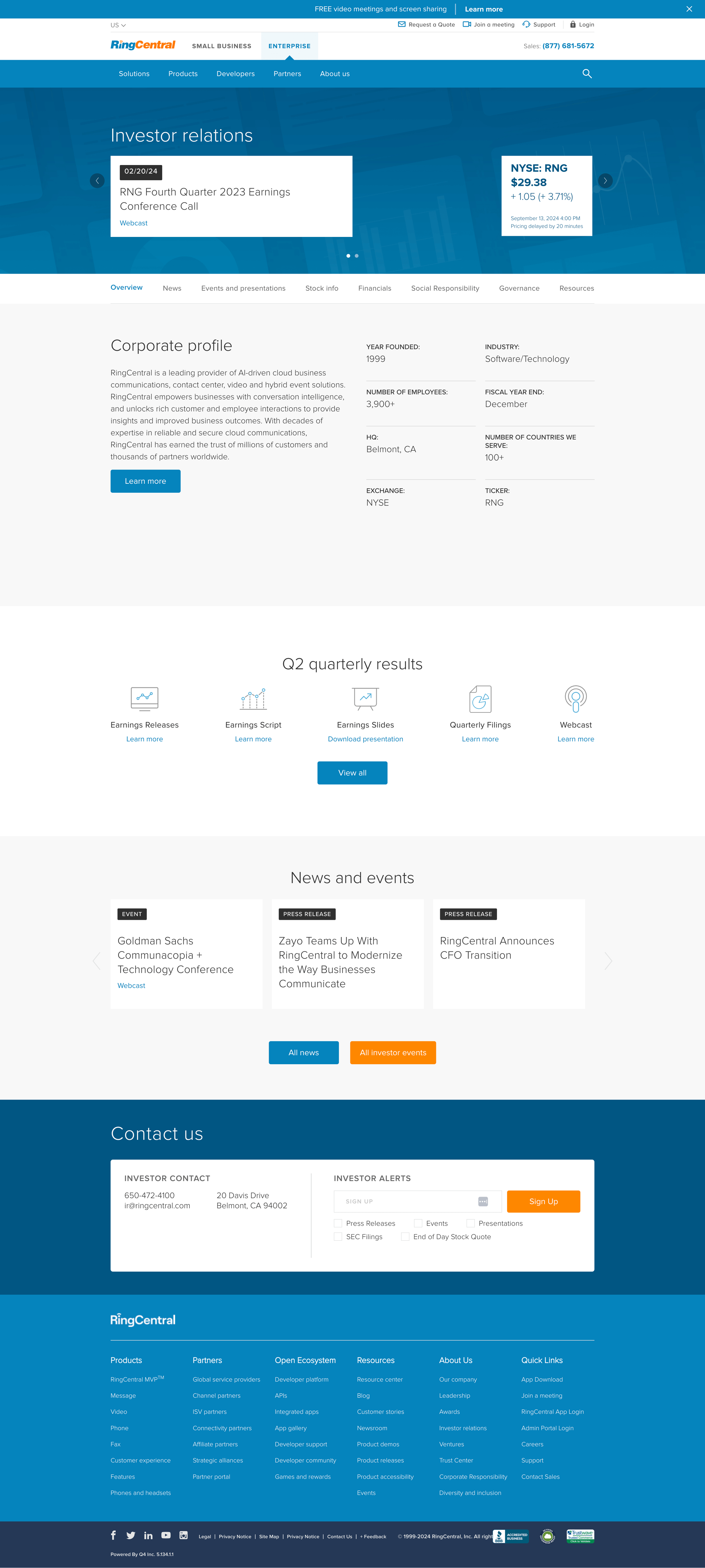
Investor Relations Home Page
Events and Presentations Page
Financial Summary Page
Contribution
Web UI/UX and Visual Design
User Flow
After extensive research of Investor Relations common practices, I mapped the user flows and journey to create an easy and seamless experience for the users.
Web Elements, Wireframe and Grid System
A wireframe was created to outline key web elements and ensure alignment with project objectives. Once approved, the design moved to the visual phase, utilizing a flexible grid system for responsive design. The desktop layout used a 12-column grid, while smart devices employed a 4-column grid, maintaining consistent alignment and a balanced vertical flow across all pages.
Landing Pages
The completed landing pages showcase a streamlined, unified design, seamlessly integrating branding elements with simple navigation. This approach improved the user experience by making the content more accessible.


