CASE STUDY
RoadRunner Rifle Rest
Project Type
Visual Identity
Team
Art Director - Jennifer Wanderer
Web Manager - Duncan Blake
Contribution
Art Director and Brand Designer
RoadRunner Rifle Rest is a company that caters to outdoor equipment enthusiasts seeking precision in hunting and photography. Offering a simple yet ingenious solution, RoadRunner Rifle Rest is a device that seamlessly attaches to the side of most trekking poles, transforming them into a sturdy platform.

OVERVIEW
Creating a Visual Identity
Tasked with developing a visual identity that embodies RoadRunner Rifle Rest's vision of adventure and precision, I crafted a contemporary design that resonates with the brand's values and appeals to its diverse audience.
RoadRunner Rifle Rest, a newcomer in the competitive outdoor equipment market, needed to capture the interest of hunters, birders, and photographers. I created a compelling visual identity to communicate the product's innovation and practicality, featuring a roadrunner-inspired logo and a modern design language, ensuring a successful market entry.
Challenge
Brand Recognition: Creating a strong and recognizable brand identity to differentiate RoadRunner Rifle Rest from competitors.
Target Audience Engagement: Developing a visual identity that resonates with outdoor enthusiasts and conveys the product's versatility and practicality.
Market Presence: Building credibility and a strong market presence as a newcomer.
Product Communication: Clearly communicating the product's unique features and benefits including stability, lightweight design, and adaptability for multiple devices.
Solution
Research and Market Analysis: I conducted in-depth research on industry trends to craft a visual language resonating with the audience.
Visual Identity Development: My approach culminated in a vibrant visual identity, embodying themes of stability, adventure, and innovation that define RoadRunner Rifle Rest.
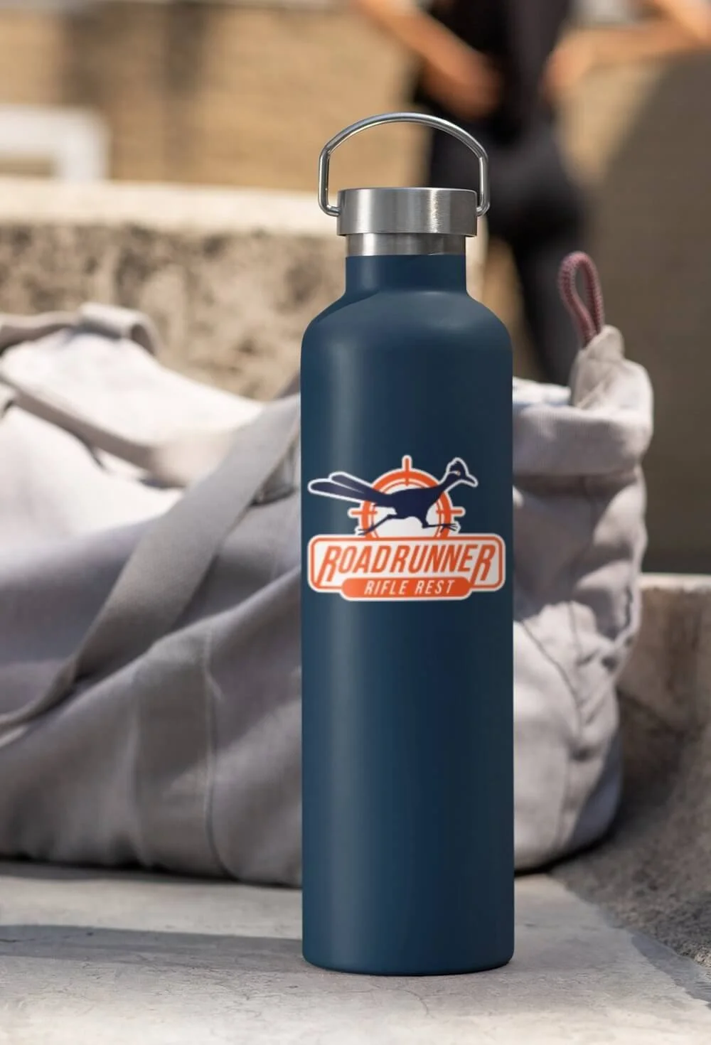
Logo Design: Inspired by the roadrunner bird's speed and precision, the distinctive logo ensures instant brand recognition and differentiation in the market.
Design Language and Implementation: I created a cohesive design language to extend across all platforms, ensuring consistent and impactful brand representation from packaging to promotional materials. By adopting a modern approach, I ensured RoadRunner Rifle Rest stands out from typical aesthetics seen in hunting and birding industries.
DESIGN PROCESS
Research
My initial steps involved a thorough analysis of the hunting industry, aiming to pinpoint distinctive colors that would set RoadRunner Rifle Rest apart.
I observed in the research, the market predominantly features colors in browns, greens, muted grays, and occasional pops of orange.

Mood Board
Color played a pivotal role in shaping RoadRunner Rifle Rest's visual brand identity, starting from the logo development phase to ensure a cohesive and impactful representation.

Logo Concept Development

The client requested a logo that captured not only the roadrunner's agility and quickness but also conveyed the product's core function.
Additionally, they needed two types of logos: a Combination Mark Logo and, as space on the product was limited, a Word Mark Logo. After developing several concepts, I focused on a design featuring a dynamic, running roadrunner with visual speed elements in the typography.
I created a scope to illustrate the product's primary function of stabilizing shots. This highlights the precision needed for shooting with guns, scopes, or cameras, appealing to hunters and bird watchers alike. The final logos effectively combine swiftness and accuracy, capturing the spirit and utility of the RoadRunner Rifle Rest.
LOGO DISCOVERY
Inspiration
The RoadRunner Rifle Rest logo draws inspiration from the roadrunner bird, embodying speed, precision, and resilience. Reflecting the client's experiences at the RoadRunner Ranch in Texas, the logo captures the bird's essence with a distinctive and contemporary design.


Branding Assets
VISUAL IDENTITY

Font Pairing
Pairing Outfit.io with DM Sans creates a cohesive blend: Outfit.io lends a bold, distinctive look to headlines and subheads, complemented by DM Sans's clean, readable style for body text. This pairing establishes a clear visual hierarchy and reinforces brand consistency with complementary sans serif fonts.

Brand Colors
Initially, finding the right hunter orange shade to work well across RGB and CMYK was challenging. Additionally, selecting a dark navy blue/black posed difficulties, as it needed to complement the orange without veering into unintended themes (Halloween).
During extensive CMYK testing, I adjusted the navy blue/black hue to ensure consistency across different paper types, combating variations in paper porosity that occasionally skewed the color towards a brighter blue or jet black. It was crucial that these CMYK values also matched the RGB values used on the landing page and social media channels for brand consistency.
Throughout the process, Pantone colors were used as the primary reference for accurate reproduction on packaging and printed materials, supported by various applications, color.a11y.com and coolors.co to match RGB/HEX colors for digital assets.


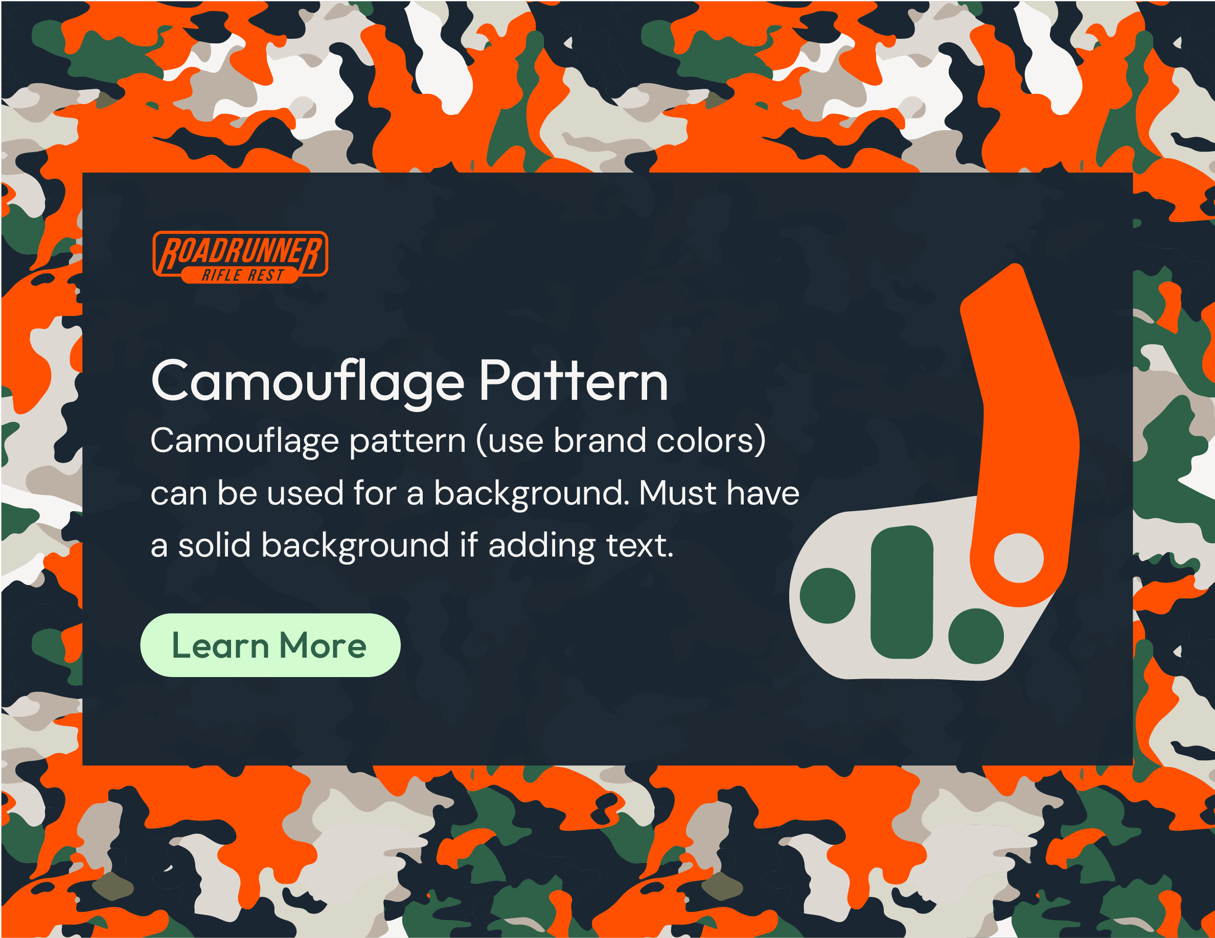
Pictograms and Patterns

Pictograms for the RoadRunner Rifle Rest were crafted using basic geometric shapes to effectively communicate key concepts. These minimalist icons serve to enhance understanding and visual appeal across various brand materials.
Additionally, I designed hunting-inspired patterns using the brand's colors. These patterns are strategically applied in flyers, ads, tradeshow booth graphics, and as backgrounds for product icons, adding texture and visual interest while resonating with the hunting community. This cohesive approach reinforces not only the brand identity but also enhances visual presence in targeted promotional materials.

Brand Guidelines


PACKAGING
Product Packaging
I worked closely with their product designer to create a hang tag for the device, iterating through numerous revisions to fine-tune the package size and instructional illustrations. It was necessary to ensure adequate space for a small plastic bag containing screws and a wrench to be stapled onto the backside of the hang tag.
Due to budget constraints, digital printing instead of offset printing was selected which limited our material choices. I identified 24pt paper board C2S (coated two sides) as a durable and print-friendly option because plastic substrates, styrene did not retain detail well with digital printing. Partnering with the client's local printer, we utilized an Indigo Printer to meticulously adjust the Pantone colors, adding 2% more black to achieve a precise blue/black shade and ensure the final package matched the RGB/HEX colors accurately online.


WEB WIREFRAME
Pre-Launch Landing Page
I designed a simple wireframe for the pre-launch website to guide the web manager in creating a parallax site for the new product launch in June 2024. The client, along with the web manager, curated videos and product photography specifically for the website, which will also be utilized across social media platforms and future promotional events such as tradeshows. This initial design will evolve over time as the product and brand grow.

Wireframe Pre-Launch Website

Pre-Launch Live Website